: Biography, Real Name, ISI, Dhurandhar Movie, Real Life and Death")

: Biography, Age, Height, Husband, Career, TV Shows, Net Worth and More")


Choosing wall art sounds easy until you’re actually staring at two totally different options: one piece is calm, soft, neutral, and “safe”… and the other is bold, colorful, intense, and impossible to ignore.
That’s the moment most people freeze.
Because both options can look amazing in a modern home, but they don’t create the same energy. Neutral art makes a space feel peaceful and elevated. Bold art makes a space feel alive and unforgettable. The real goal isn’t picking the “better” style. It’s choosing what your room needs.
This guide will help you decide between bold and neutral art without guessing, show you how designers use both styles, and teach you how to make either one look high-end in your home. If you want inspiration as you read, you can browse modern wall art on MusaArtGallery and compare different moods and styles.
First: What Does “Bold Art” vs. “Neutral Art” Actually Mean?
Neutral art usually uses softer palettes and calmer composition. Think beige, cream, sand, soft grey, subtle blacks, warm minimal tones, gentle abstract shapes, and calm photography. It’s often designed to blend with the space instead of dominating it.
Bold art is designed to lead. It grabs attention. It uses high contrast, bright colors, heavy saturation, strong shapes, graphic compositions, or intense subject matter. It’s the kind of piece that becomes a conversation starter the second someone enters the room.
Neither one is “more stylish.” The best choice depends on what your space needs to feel complete.
The Real Question: Do You Want Your Art to Blend or Lead?
Interior designers almost always make one decision before they even choose a piece: should the art blend into the room, or should it lead the room?
Neutral art blends. It supports the furniture, the wall color, the lighting, and the textures. It’s a background layer that makes everything look cohesive.
Bold art leads. It becomes the focal point. The furniture becomes the frame. The room exists to support the artwork.
When you’re choosing between bold and neutral, what you’re really deciding is: do you want the room to feel calm and polished, or energetic and expressive?
When Neutral Art Is the Best Choice
Neutral art is perfect when you want a home to feel elevated, clean, and timeless. It works beautifully in modern interiors because it doesn’t overwhelm the space. It lets the architecture and furniture speak, while still adding warmth and personality.
Neutral pieces are especially powerful in bedrooms and calm living rooms. They create a relaxed atmosphere, which is the whole point of those spaces. Neutral art also helps small rooms feel bigger, because there’s less visual noise.
It’s also a smart choice if you change your décor often. Neutral art tends to be “future-proof.” You can switch rugs, pillows, chairs, even paint colors, and the art still works because it’s not tied to a trend.
Neutral art is great if your space already has strong design elements, like a bold patterned rug, colorful furniture, textured wallpaper, or dramatic lighting. In that case, neutral art balances the room so it doesn’t feel chaotic.
When Bold Art Is the Best Choice
Bold art is what you choose when your room feels too quiet.
Many modern homes are neutral: white walls, beige sofas, light wood floors, minimal furniture. It looks clean, but sometimes it feels like something’s missing. Bold art solves that instantly.
Bold wall art adds personality fast. It can make a room feel creative, modern, luxury, edgy, or playful. It also creates a focal point, which makes the entire room feel more designed. People don’t realize how much a room needs a focal point until they add one.
Bold art works especially well in large living rooms, dining rooms, hallways with big empty walls, and home offices. It makes the space feel alive.
And if you love interiors that feel different, bold art is usually the move. Neutral art can be beautiful, but bold art makes your home memorable.
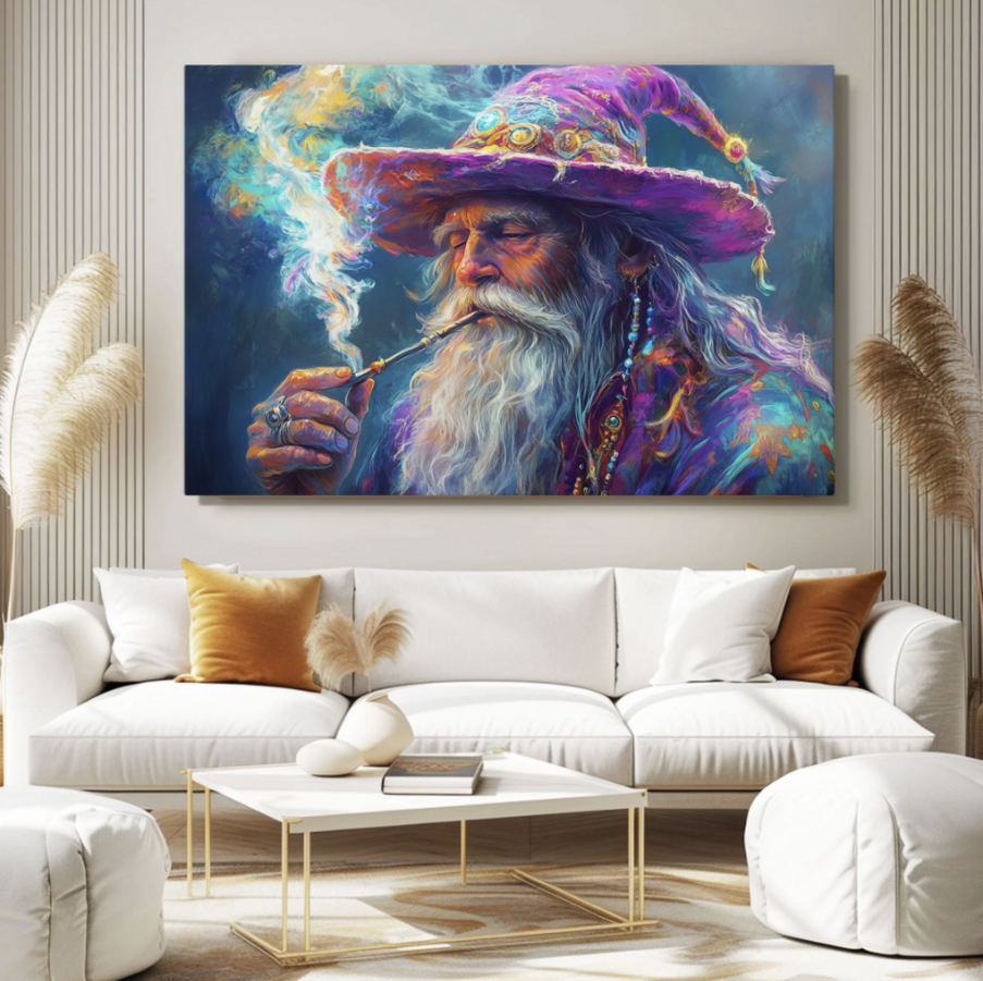
One of the best examples of bold, high-energy art is psychedelic style. It’s colorful, intense, and futuristic. If you want statement pieces with that vibe, explore Psychedelic Art and you’ll instantly see how much energy this style can bring into a modern home.
The Biggest Mistake People Make With Bold Art
The biggest mistake is pairing bold art with bold everything else.
Bold art needs breathing room. It needs a calm space around it so the eye knows where to rest. If you have bold art, keep the surrounding décor more neutral. Let the art be the star.
That doesn’t mean your room has to be boring. It just means you need balance. A colorful artwork on a clean wall with simple furniture looks premium. The same artwork surrounded by loud patterns and clutter can feel messy.
Design is always a game of contrast.
The Biggest Mistake People Make With Neutral Art
Neutral art can look incredible… but it can also disappear.
The biggest mistake is choosing neutral art that is too small or too low contrast for the wall. You end up with a piece that technically matches everything but doesn’t add anything.
If you choose neutral art, you want it to still have presence. That means paying attention to texture, composition, and size. A large neutral canvas with good movement and depth looks luxurious. A small neutral print with no contrast can look forgettable.
Neutral art still needs impact. It just delivers impact in a quieter way.
How to Choose Based on Your Room’s Purpose
A simple way to decide is to match art energy with room function.
Bedrooms usually look better with neutral art because the space is meant for rest. Soft abstract pieces, calm landscapes, and neutral tones create that relaxed atmosphere.
Living rooms can go either way. If your living room is already busy with textures and color, neutral art will make it feel balanced. If your living room is too simple, bold art will wake it up.
Dining rooms handle bold art beautifully because they’re social spaces. People talk, eat, and spend time there. Bold art adds mood.
Home offices often benefit from bold art if you want motivation and creativity, but neutral art works if you want focus and calm.
Hallways can go bold if your home feels too neutral overall, or neutral if you want a clean “gallery” effect that ties the space together.
The “Accent Color Rule” That Makes Everything Easy
If you’re unsure, use this rule: your art should connect to your room through one accent color.
That could be:
a black frame that matches your light fixtures, a warm beige tone that matches your rug, a deep green that connects to plants in the space, or a small red accent that matches your cushions.
This works for both bold and neutral art. You don’t need the art to match everything. You just need a small connection so it feels intentional.
Bold + Neutral Together: The Designer Mix That Always Works
A lot of homeowners think they must choose one style for the whole home. Not true.
The best-designed homes often mix bold and neutral art in different rooms. That’s how you create rhythm. Your living room can have a bold statement piece, while your bedroom has calmer neutral art. Your hallway can stay clean and minimal, while your dining area gets something more intense.
This mix keeps the home interesting without feeling chaotic. Each room has its own vibe, but the whole house still feels curated.
Final Thought: Choose Art That Matches Your Personality, Not Just Your Sofa
At the end of the day, art is the most personal part of home décor. Furniture is functional. Art is emotional. And the best homes are the ones that feel like the person living there, not like a showroom.
If you want your home to feel timeless and calm, neutral art is your best friend. If you want your home to feel bold, creative, and unforgettable, bold art is the move.
Refresh Date: January 27, 2026